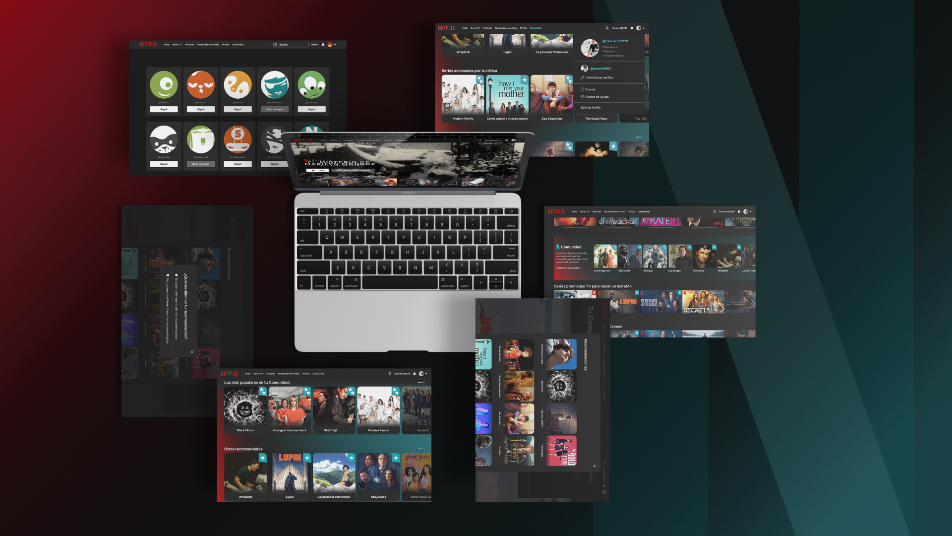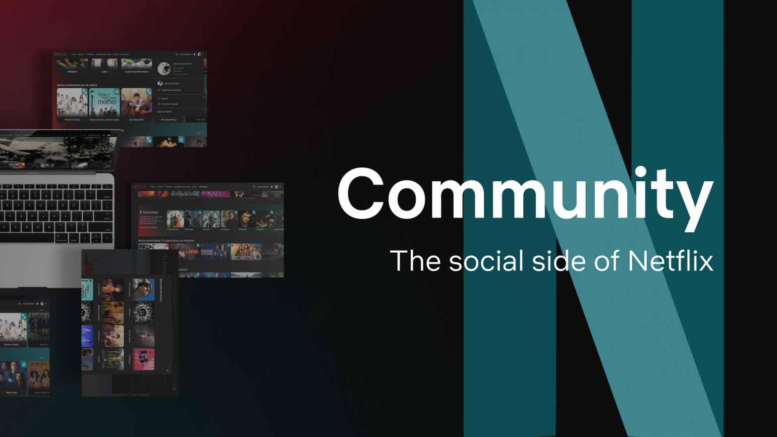
Netflix Community is a team project that I took part in during the Initiation of Interaction Design course. Its main goal was to design and conduct UX research. My role as part of the team was similar to the role of my teammates, participating and collaborating in each of the case study phases, althought the final prototype was rectified on our own.
Problem and task
Netflix is the reference streaming platform worldwide, with more shows and films than any other streaming service. Its content catalogue has grown in the last years, adding thousands of movies, series and documentaries per year on its platform.
The downside of this is an increasing difficulty for the user’s decision making process, taking up to 14 minutes to choose content to watch. Adding that the platform is mostly used at night when users are more tired, the difficulty to decide and the frustration derived from this have led to an increase in the abandonment rate.
How could we help users to choose content quickly, reduce the choice time and therefore, the abandonment rate? Our task was to create a new functionality for Netflix that offered a solution to this problem.
Process

Ideating
After conducting a desk research and a competitor analysis, we defined a new functionality so that it could be tested with users. The idea of a social side for Netflix is based on our hypothesis that acquaintances’ recommendations are key for users’ content decisions. If users have the chance of access to their friends’ recommendations within the platform, the task of choosing content will be easier.
The new functionality followed the idea of simplicity and ease of understanding and using. We wanted it to be relevant for users, that it could have affinity with them. And lastly, it should be easy to identify, as well as differenciate itself from the rest of Netflix components. Considering all of that, we developed the first prototype, which was tested with users and, therefore, modified later.

Defining: research
Having our first prototype, we designed the research and the user interviews to validate the concept idea. Conducting the interviews was the most challenging part, as it was our first time, and yet, the most fruitful.
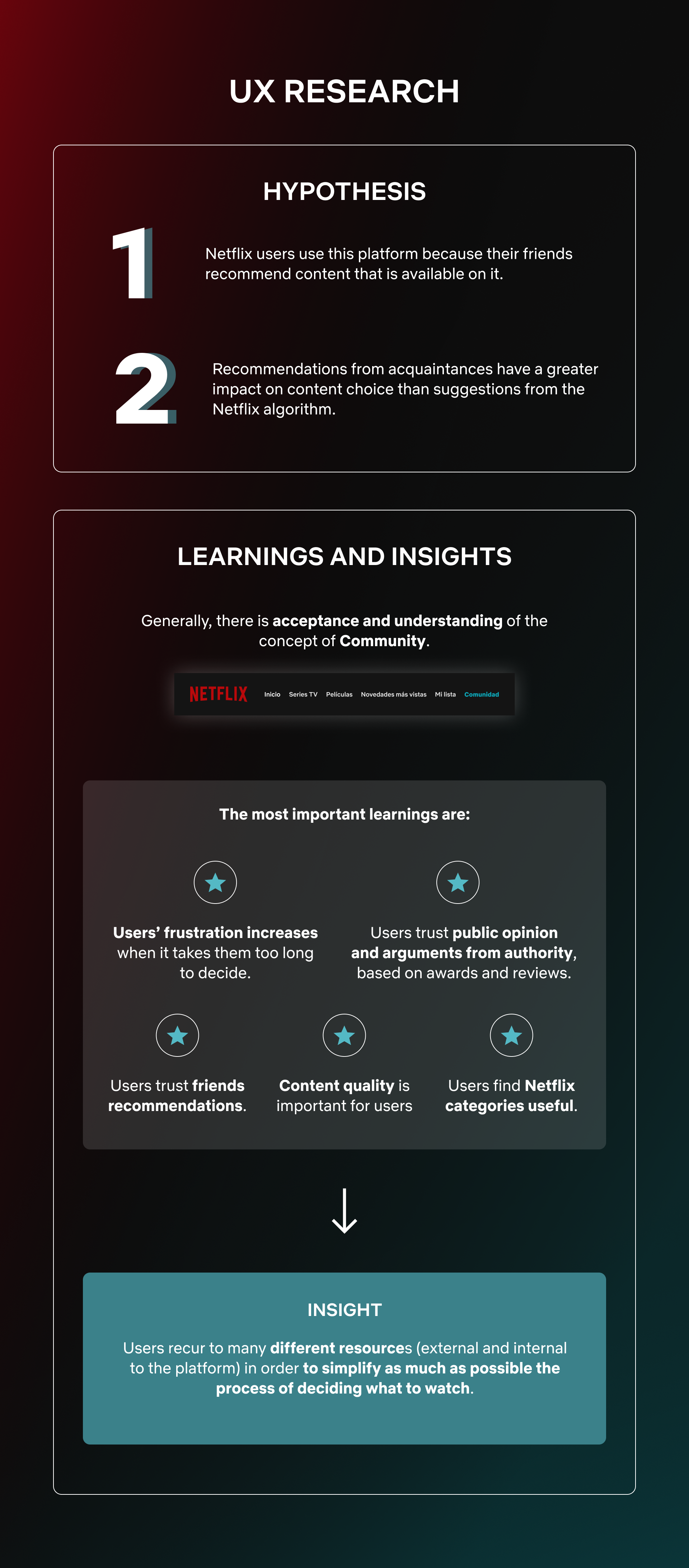
The first finding was that Community, as a concept, is easily understood and accepted. More importantly, we learnt that friends’ recommendations are the main source of assurance when choosing a series or film, therefore validating our hypothesis. However, that is not the only way users find assurance, as they look for mass opinion and argument from authority. Specifically, users also based their decisions on reviews and lists of critically acclaimed content that can be found on the internet. Besides, Netflix categories are found useful, sequencing users’ decision making process.
The most important conclusion is that, as users are tired when using Netflix, thinking and deciding become tasks to be avoided. Consequently, users recur to many different resources (external and internal to the platform) in order to simplify as much as possible the process of deciding what to watch, such as friends recommendations, reviews, awarded content, Netflix suggested categories, top 10 lists, trends lists, etc.
Re-ideating
Starting from those findings, each of us on our own developed a new prototype, maintaining the main idea, naming and identity elements, such as the logo and colours.
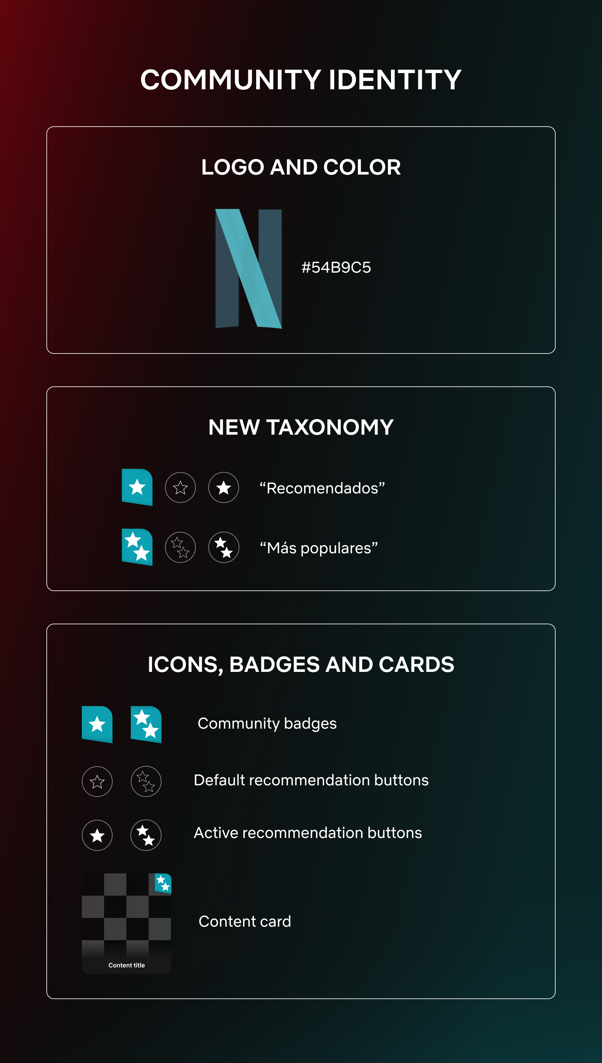
I decided to reduce the initial category complexity and use just two recommendation categories and icons: one star to represent the Recommended category, and two stars for the Most Popular category.
On the one hand, the goal of reducing the number of recommendation categories is to make user experience easier and faster. Less options reduce the anxiety of choice. On the other hand, using stars is a way of assuring affordance of the new functionality, as they are usually associated with reviews and recommendation.
The community icons will coexist with the like buttons that feed the Netflix algorithm. This way users will be able to receive both types of content feed: the one based on their behaviour and likes, along with the one based on their friends’ recommendations.
The content cards are another identity element. Having a different shape will make the Community content stand out. Rounded corners are friendlier, which goes along with the idea of a community.
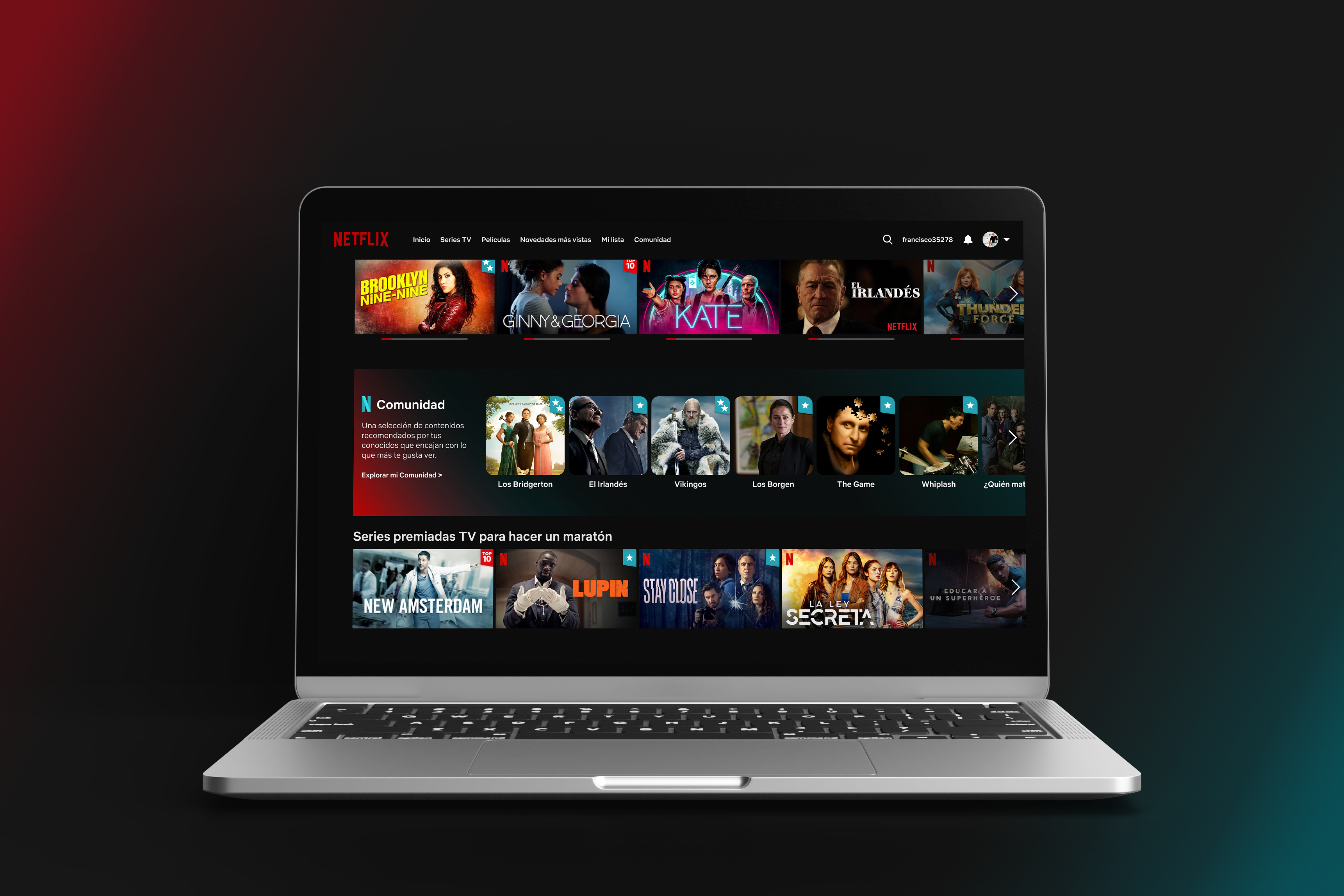
Home
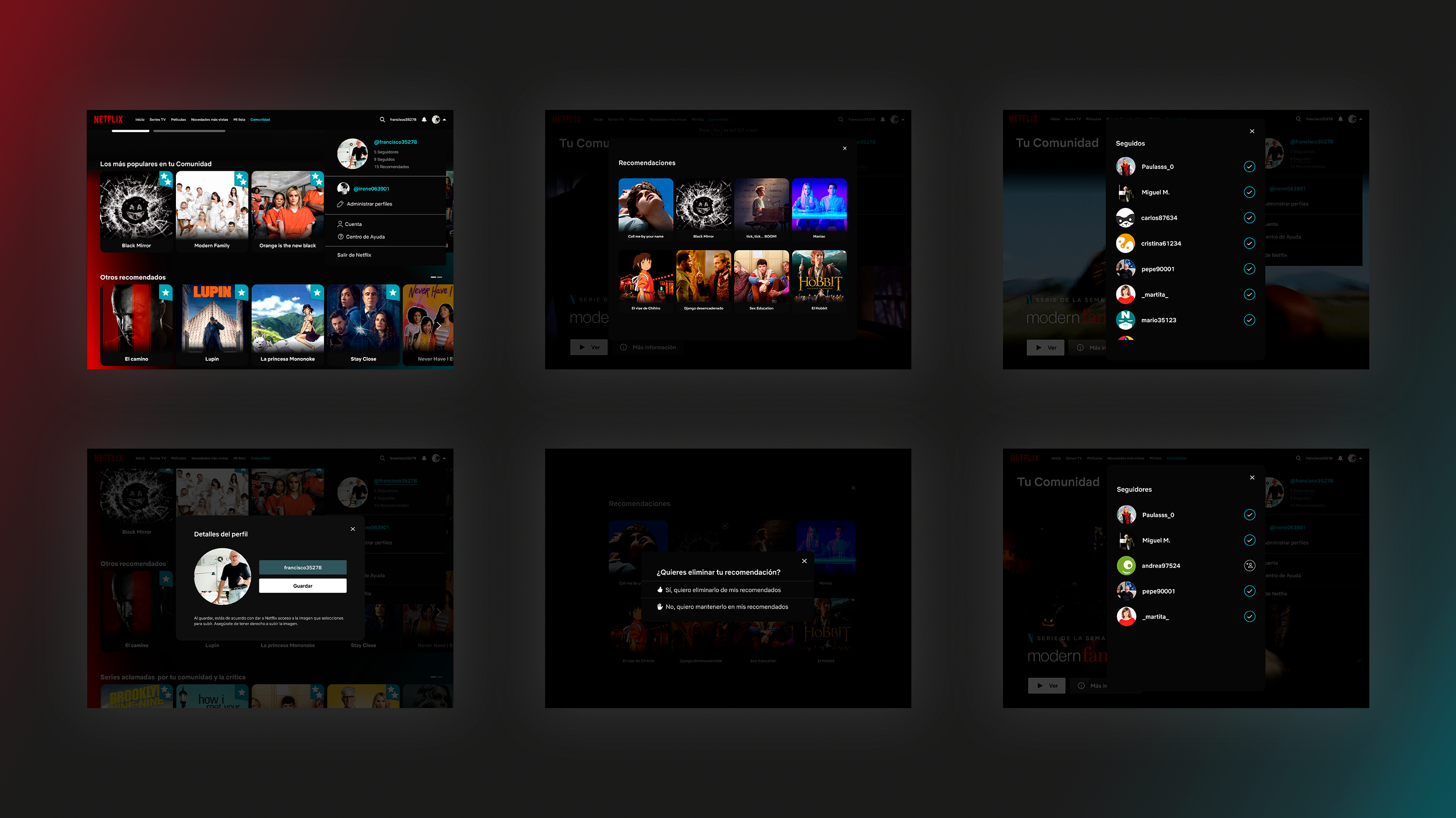
When scrolling at the main screen, users will find a new section among the lists: a Community list that contains a selection of recommended shows and films. Besides, some of the rest of the images will display the community badge, depending on what the members of their community recommend.
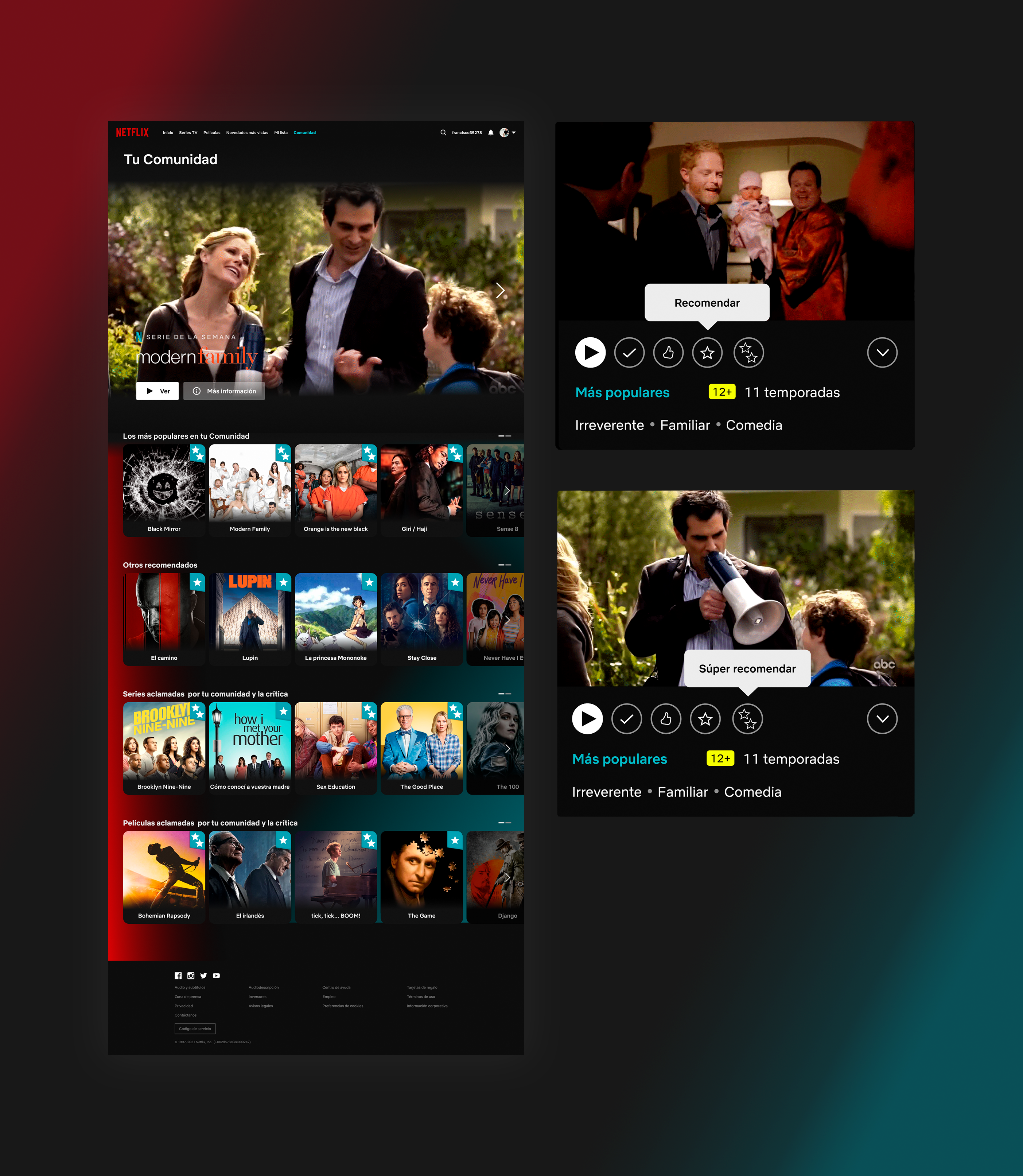
Community
Community screen first shows users the trailer of a series and a film of the week, as a way of highlighting content at first sight. Down below, there are four lists that contain shows that your community has recommended. «The most popular» among your community and «Other shows recommended» by your community, are generated when users recommend or super recommend a show. «Series acclaimed by your community and critics» and «Films acclaimed by your community and critics» are based on what your community has recommended and has also been critically acclaimed. The main object of these lists is to offer users lists with better filtered content, based on their friends recommendations and critically acclaimed content.
User profile
From this menu, community profile information can be seen and accessed: followers, following, user’s recommendation list, or change its nickname or profile picture.
