
Halloween Cereal Box
Area
Packaging
Client
IES Puerta Bonita
Year
2021
Problem
Supermarket brand wants to launch a Halloween-inspired cereal for their kid’s cereal line. The new product will be single-serve.
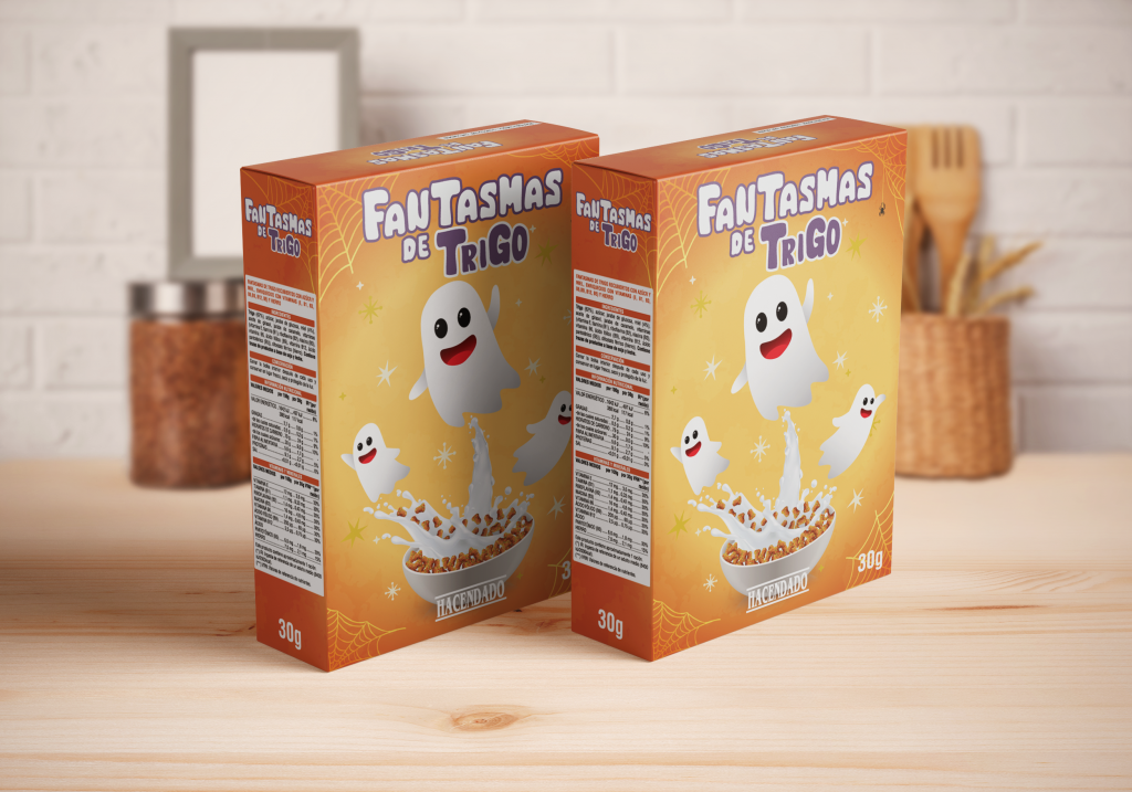
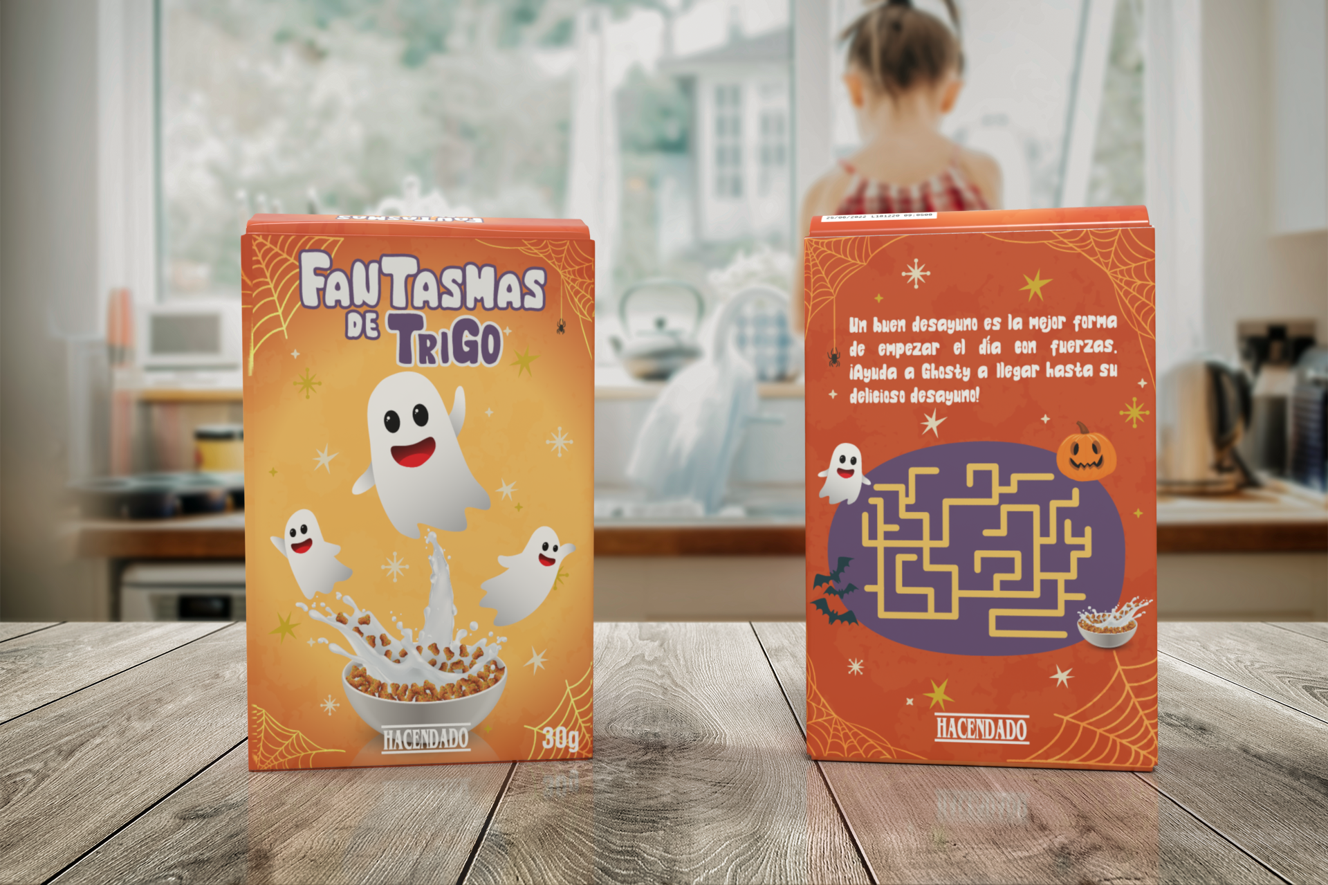
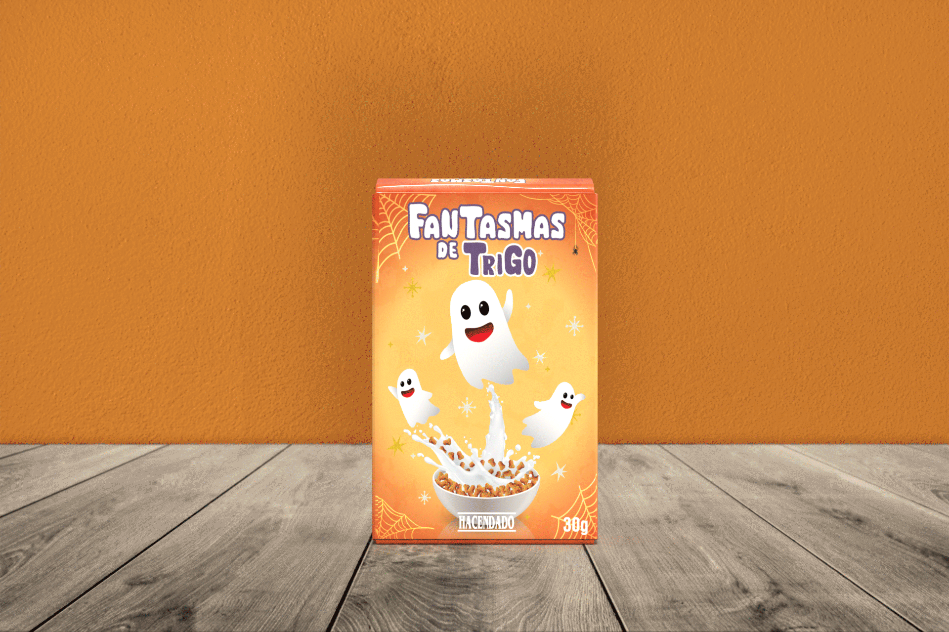
Solution
Friendly ghosts join the Monster cereal family with a colourful, visually-strong design. A funny way of bringing the Halloween spirit to customers’ breakfast and following the product line’s aesthetic.
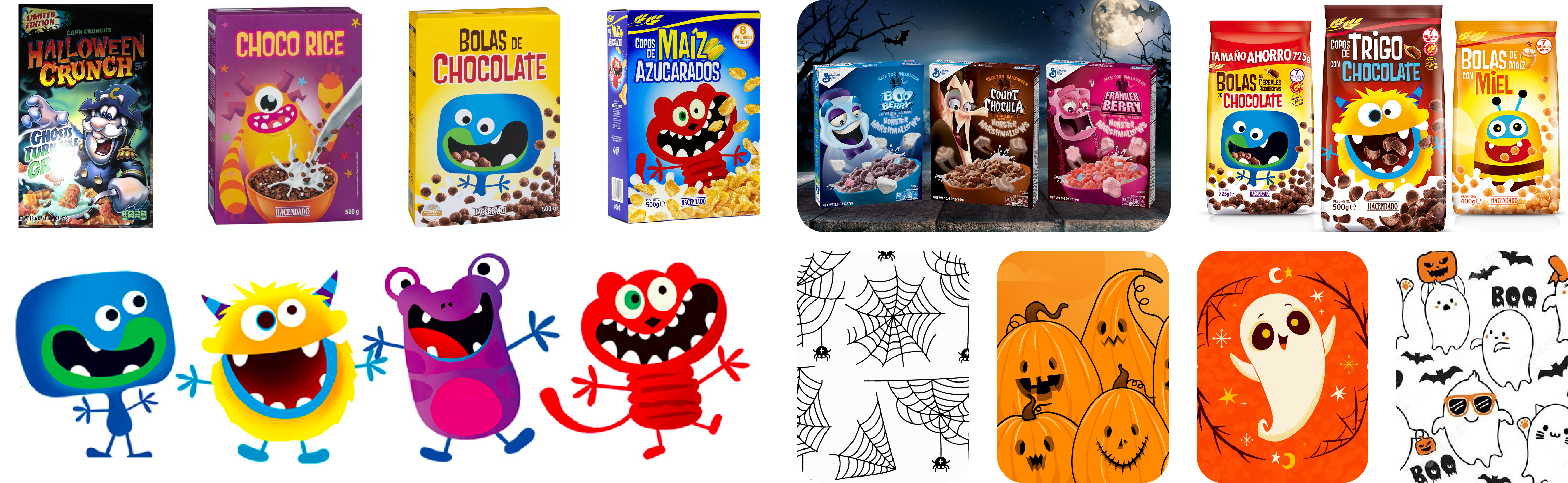
Moodboard
Research is the best way to understand the product, the market and the brand. What other kid’s cereal does this brand sell? What similar products do their competitors have? It also helps me to get some inspiration.
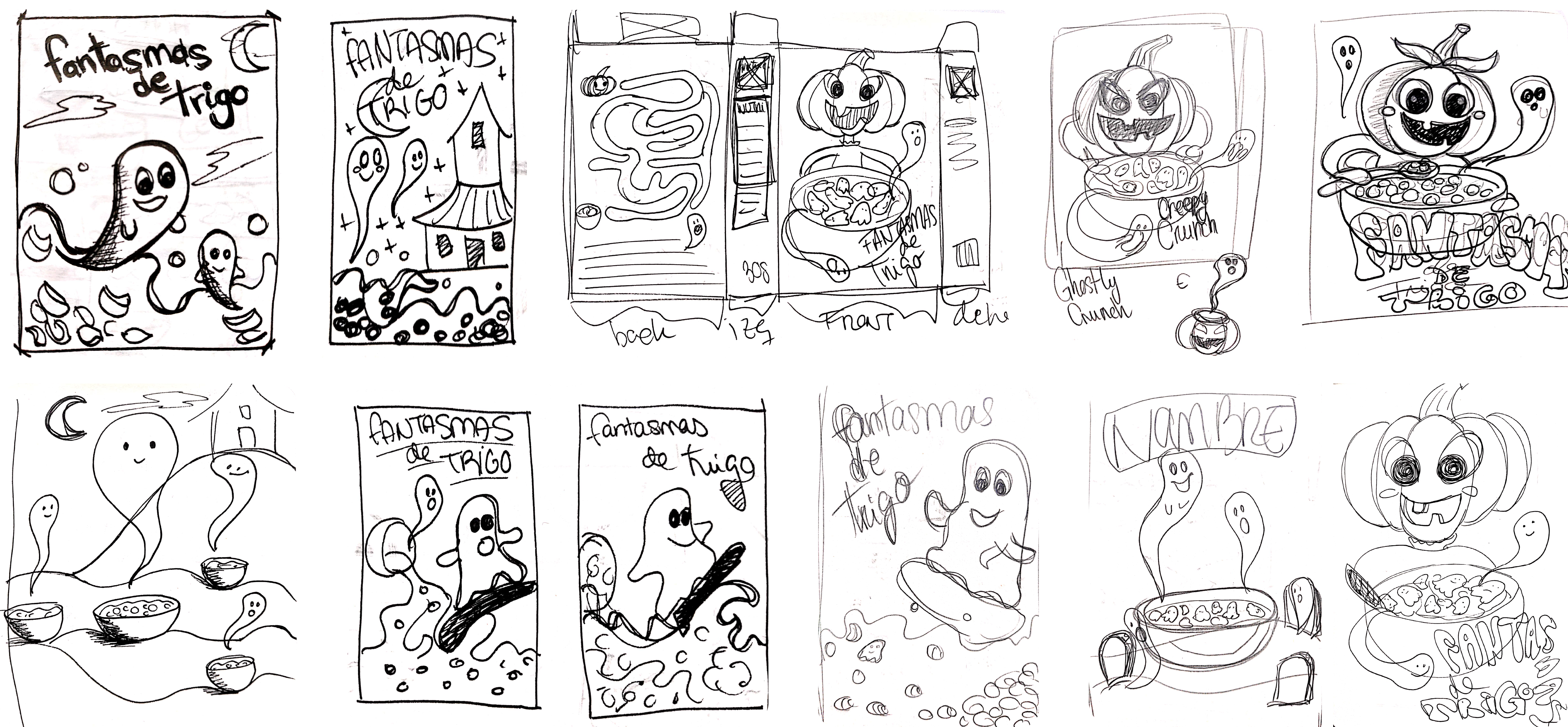
Creative process
Sketching helps me to reflect and play with new ideas. That way, I can start making decisions about layout, composition, colours, typography, etc.
Graphic elements
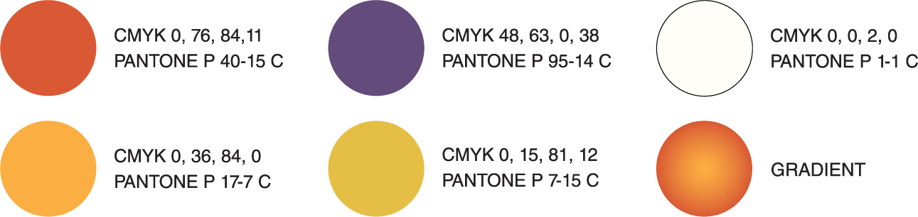
Colours
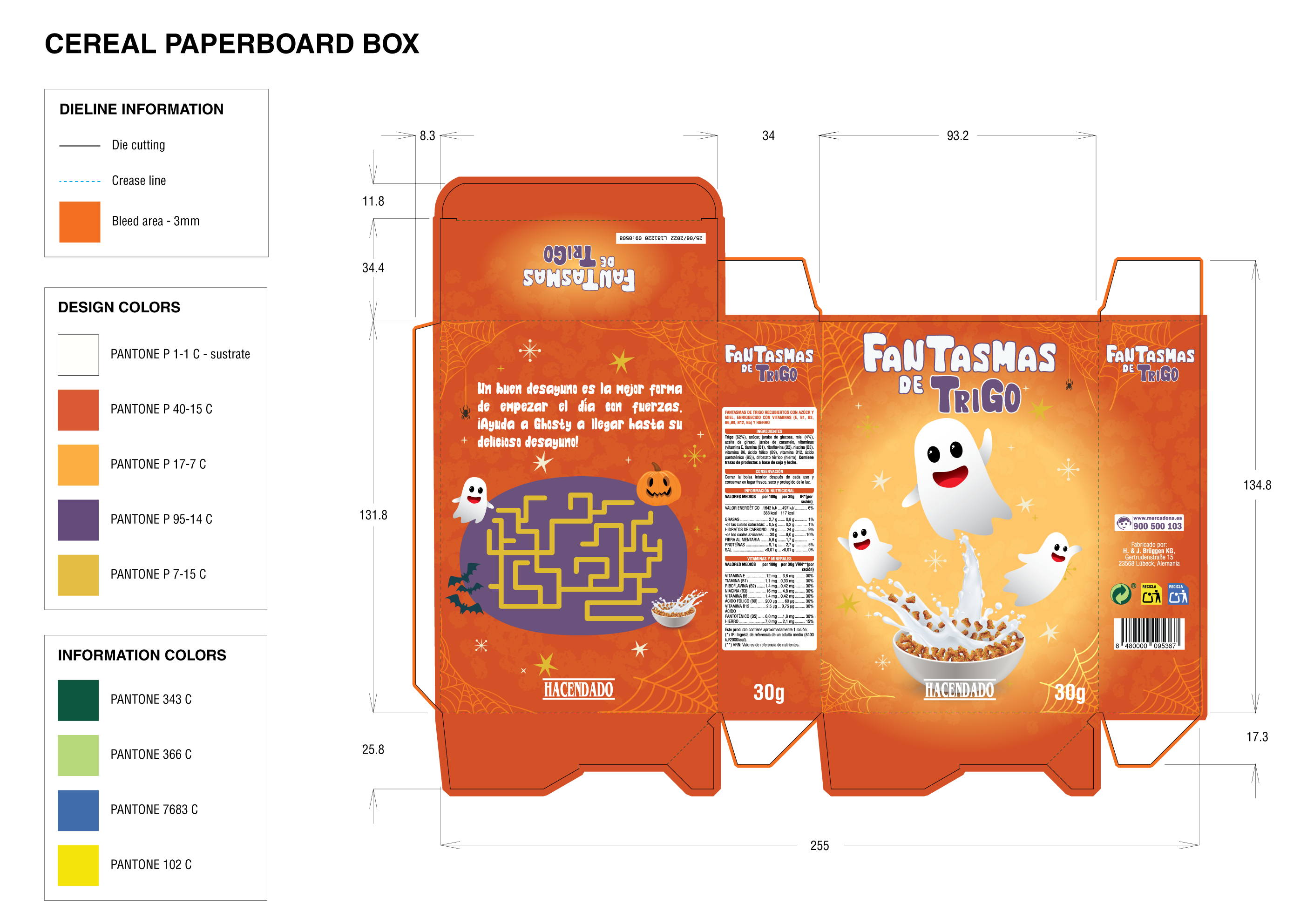
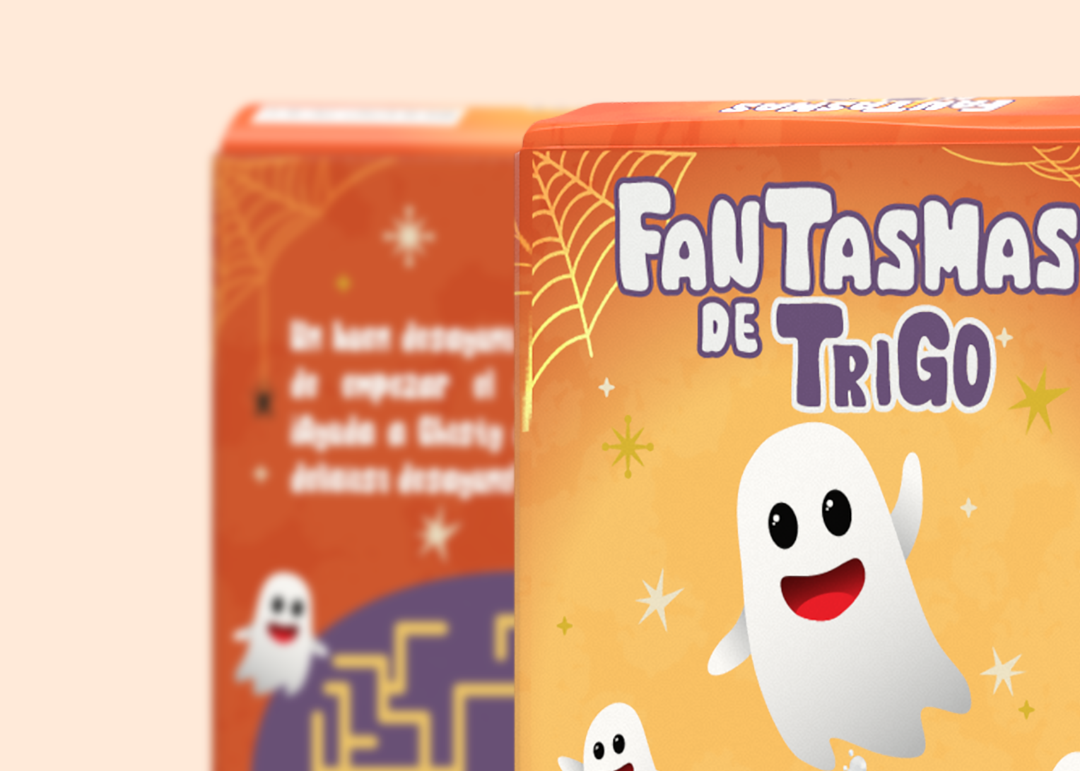
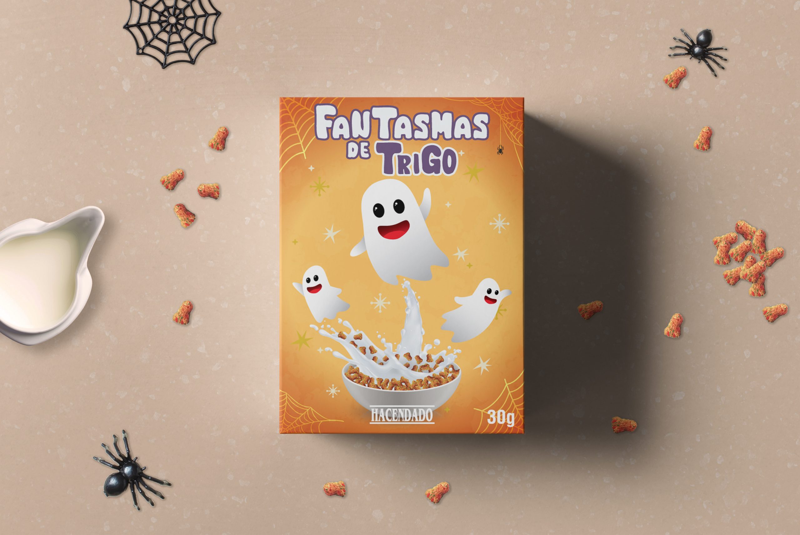
Orange is the main color for the design. First, because is the quintessential Halloween colour. An secondly, becasue the graphic style of the rest of the products generally includes warm colors.
To give greater dynamism, a gradient of orange tones has been applied to the background. And to create contrast, purple and white have been used for the texts, as well as a dark yellow for small details.
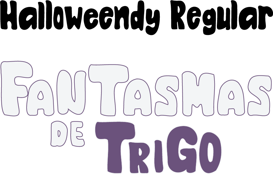
Typography
I chose the Halloweendy typeface, as it is a Halloween-inspired, wide, playful typeface, perfect for the theme of this product. For the header, I added some modifications to make it more eye-catching. First, a stroke has been added, increasing contrast. And secondly, I modified the size of some characters, making them bigger or smaller, to give it a more childish and playful touch.
Illustrations
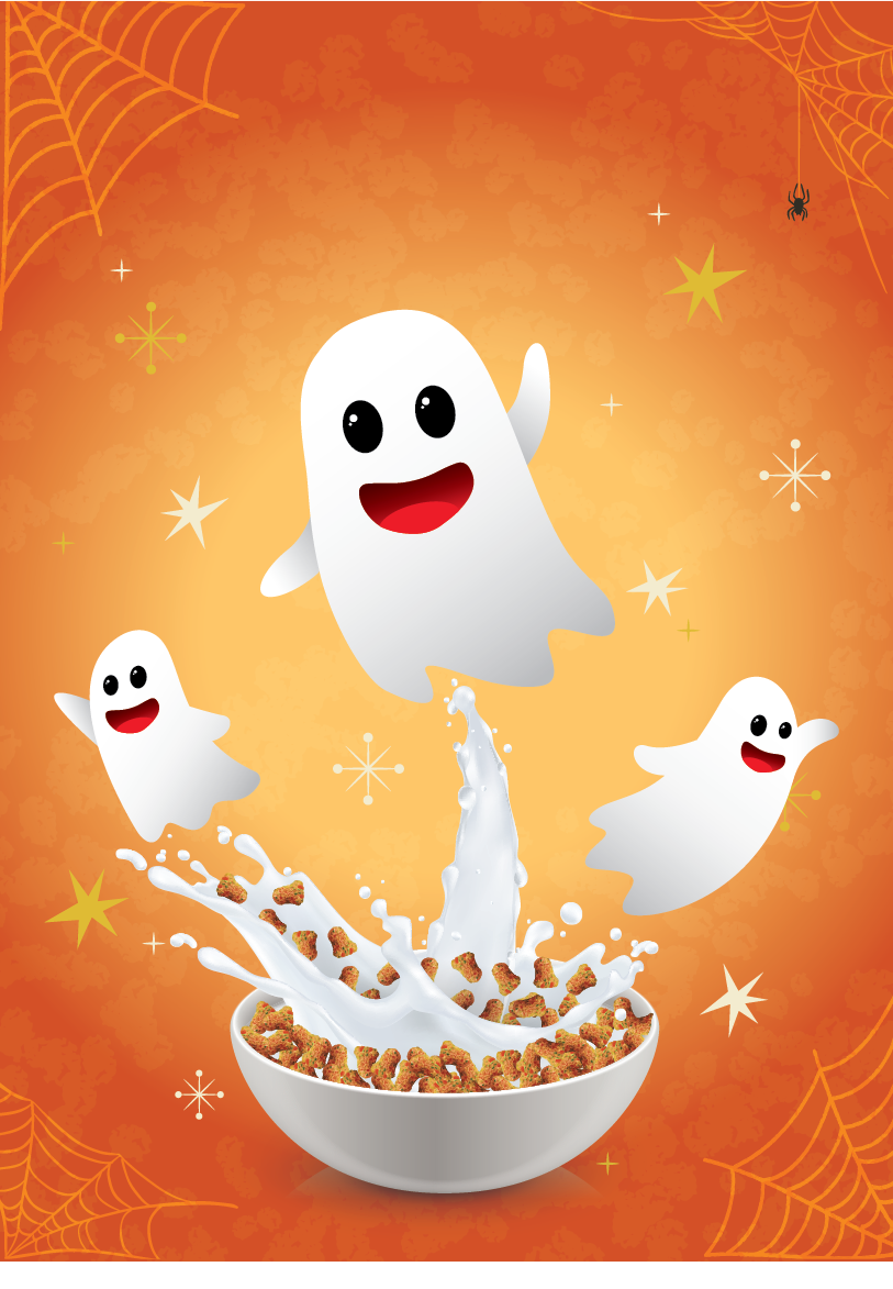
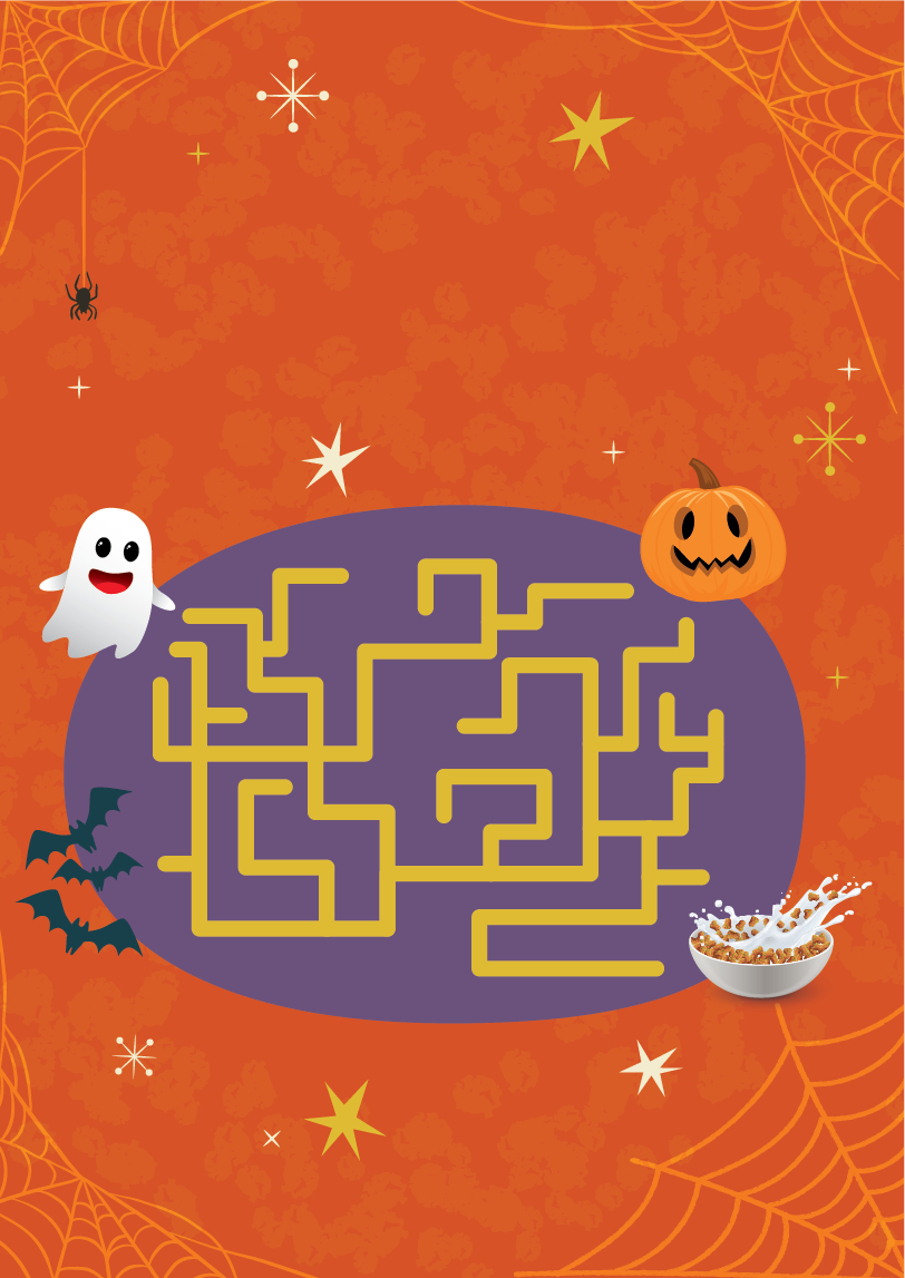
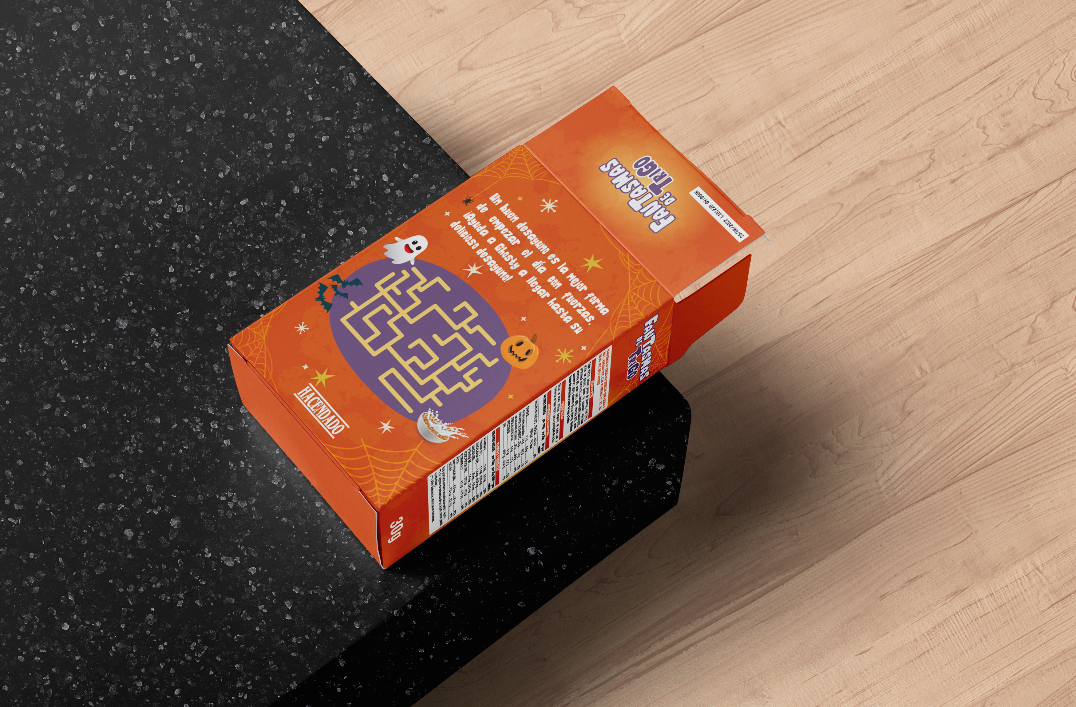
I followed the similar aesthetic of the other line products, taking examples from the supermarket brand’s own website. Their designs includes two main elements: a cute, childlike character and the cereals. Considering that, tradictional Halloween elements have been added, such as spider webs and spiders, in order to give it a more appropriate atmosphere for the theme.
Two backgrounds have also been added, one with spots that contrast slightly with the background, to give it texture, and some white and gold stars, to complement the illustrations on the back and front.
Prototype
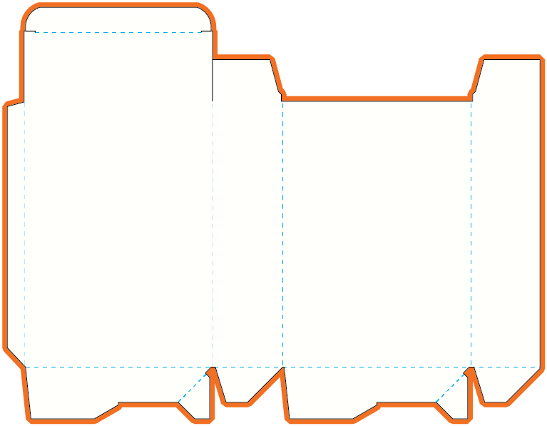
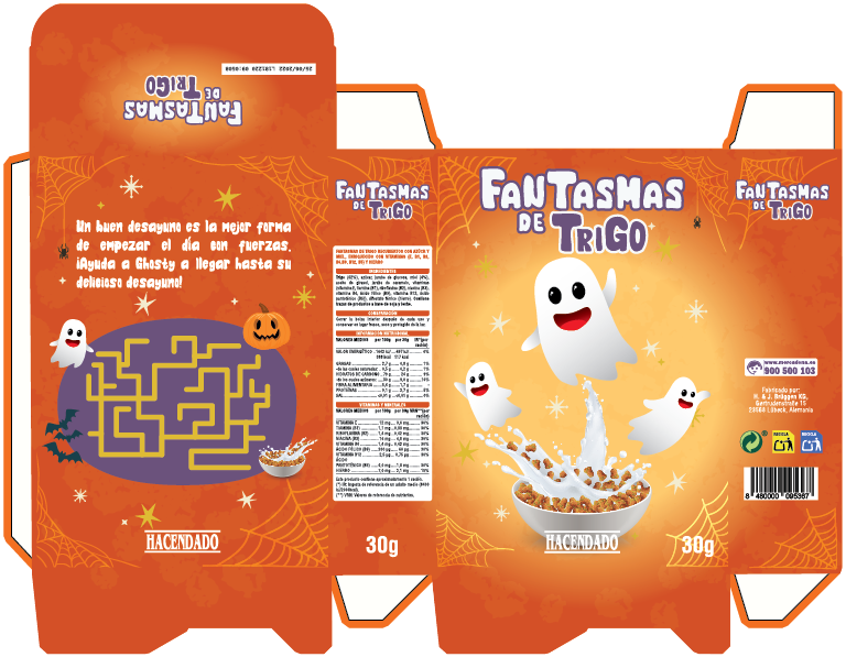
I chose a folding carton with auto-locked bottom and tuck-in flap top, as for self-serving it is more comfortable to have a tuck-in flap top. The model is ECMA A6020A.
A Halloween breakfast for the youngest ones
With a design focused on its target, consistent with the product line aesthetics, the new packaging conveys the Halloween spirit to breakfasts. It expresses the idea that this cereal will make breakfast more fun at the same time that keeps kids healthy and gives them energy.
View other projects
PRINT design
product design