
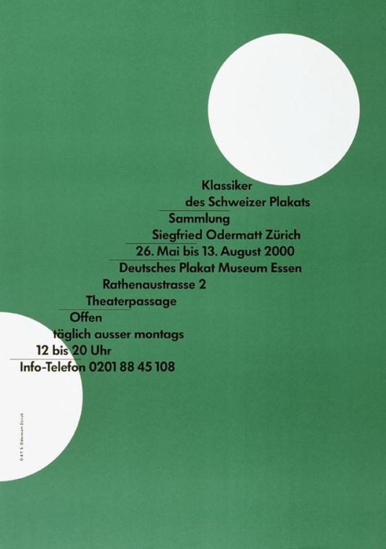
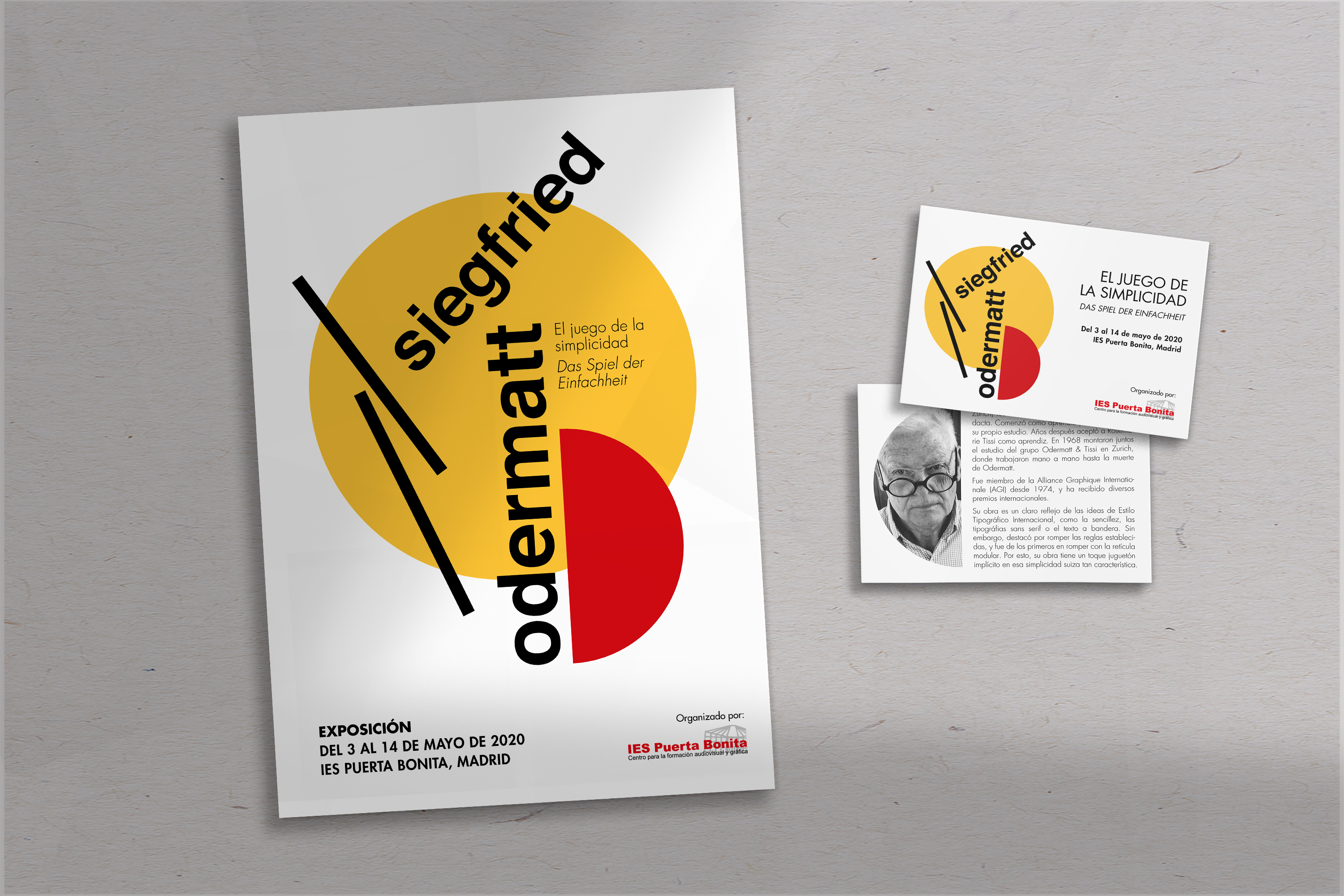
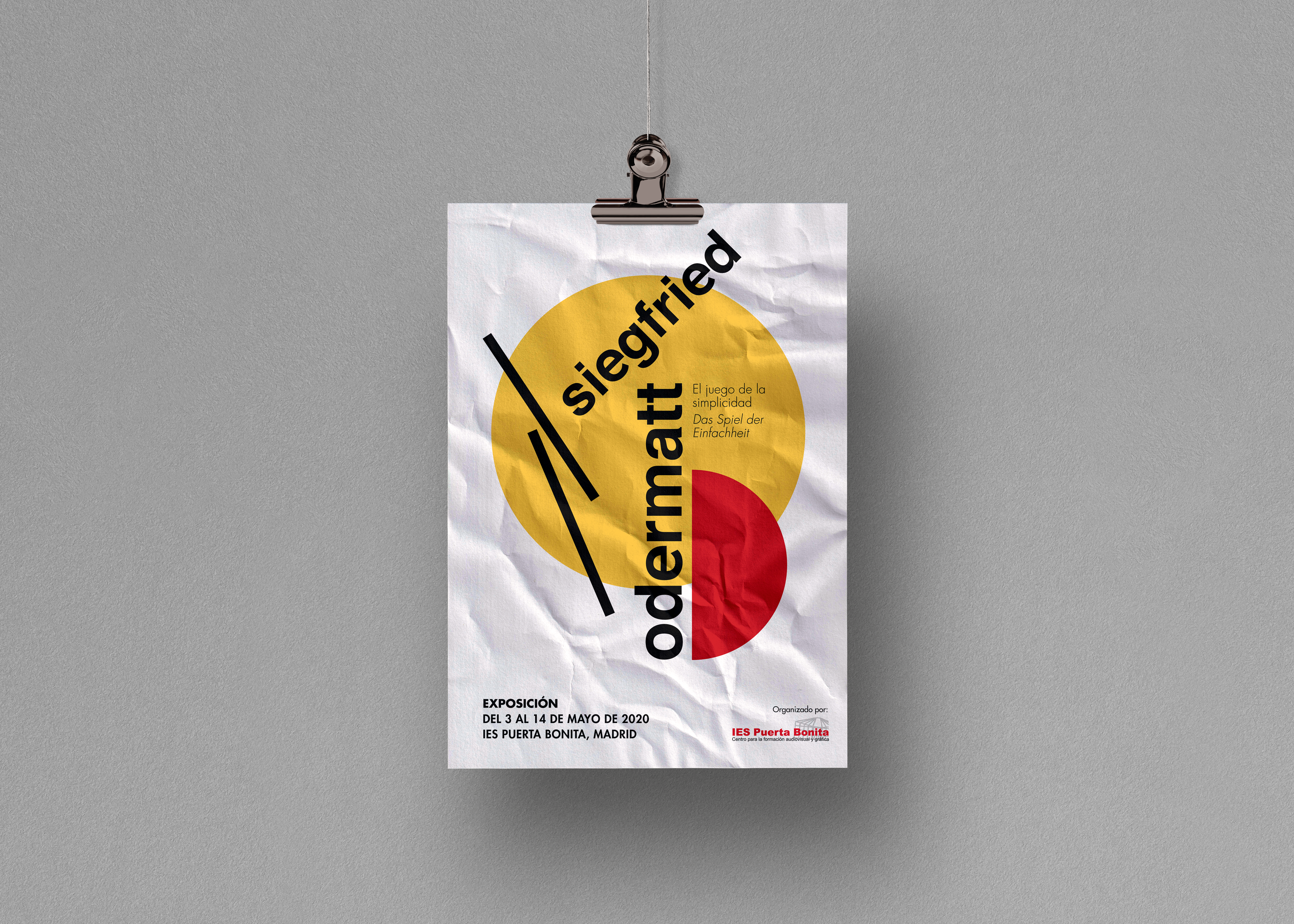
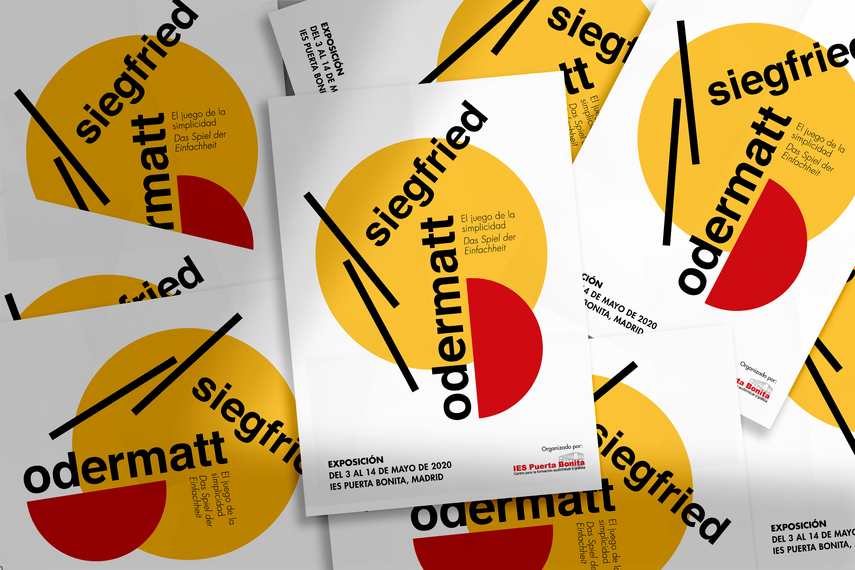
Odermatt Exhibition Poster
Area
Print Design
Client
IES Puerta Bonita
Year
2020
Problem
The school IES Puerta Bonita has organized a exhibition about Siegfried Odermatt’s work. To announce and promote it, the school needs posters and invitation postcards. A slogan for the exihibition is needed as well.
- Poster size: A3 + bleed
- Postcard size: A6 + bleed
Solution
A minimalist design fit for both poster and postcard and inspired by Odermatt’s work.
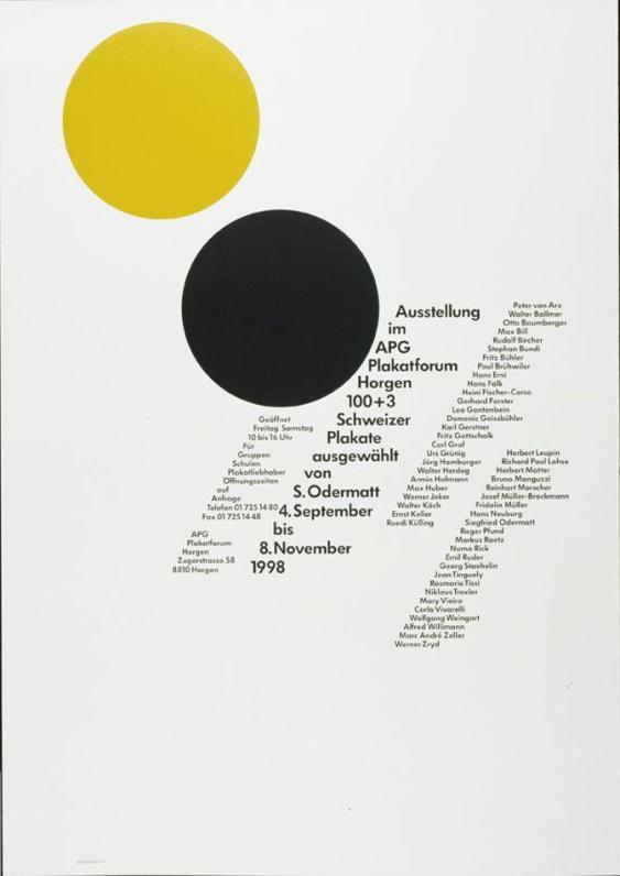
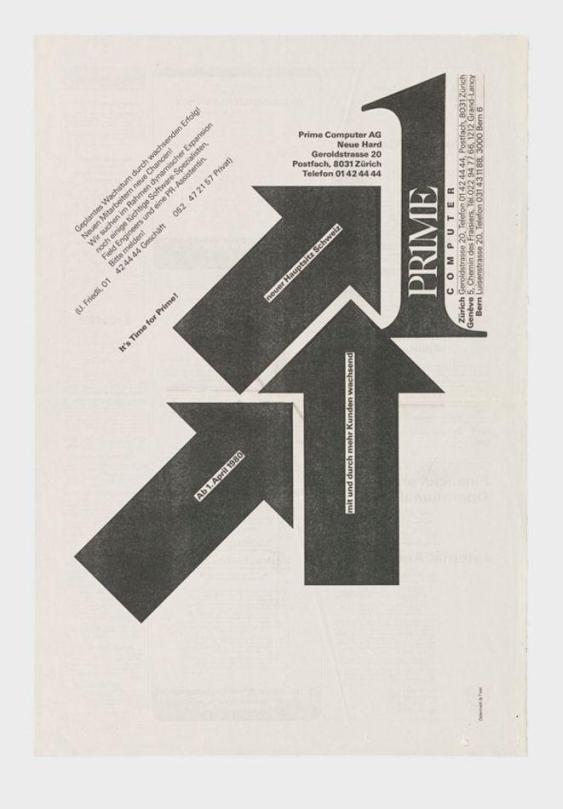
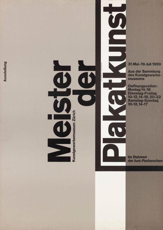
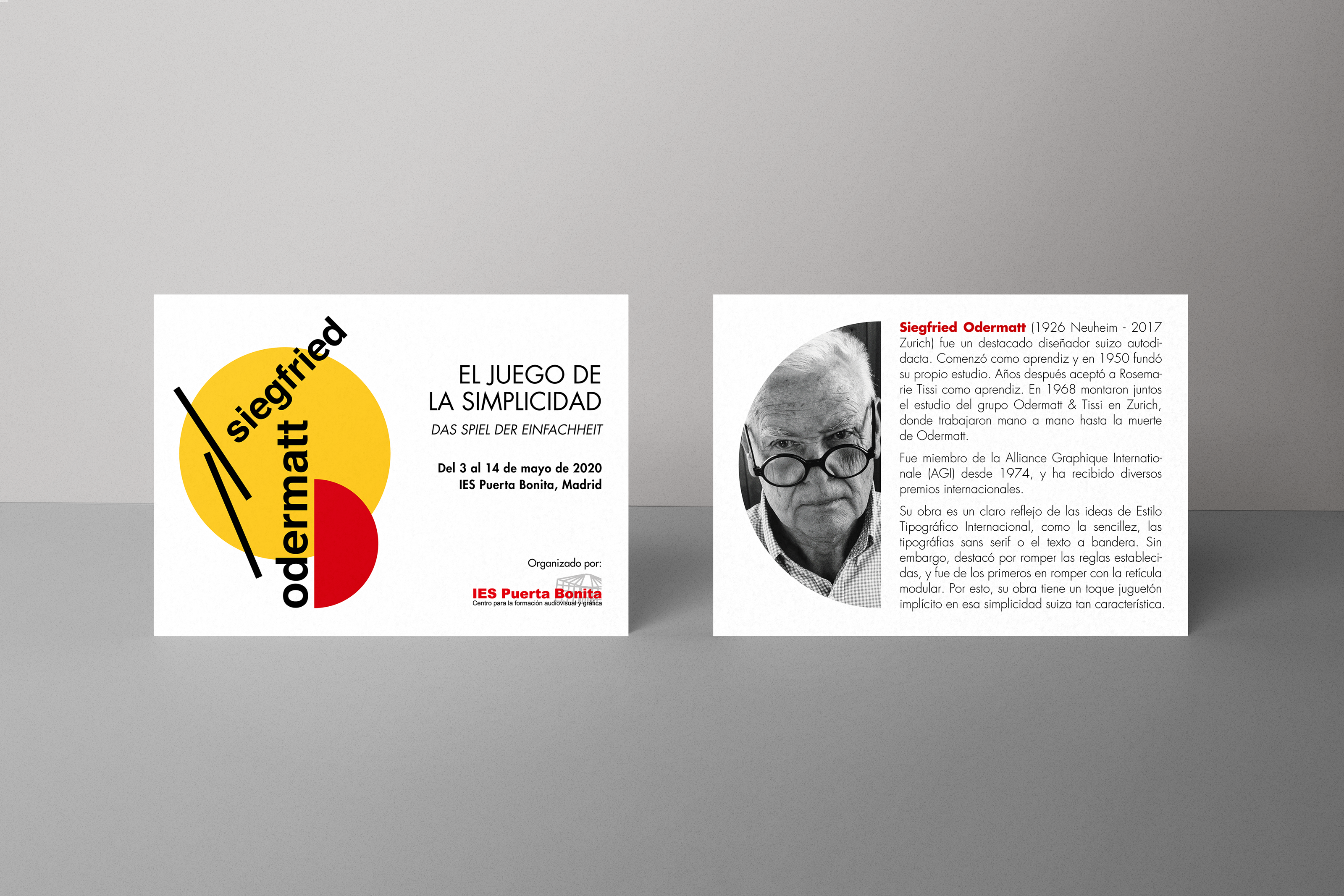
Who is Odermatt?
Siegfried Odermatt (1926 Neuheim – 2017 Zurich) was an outstanding self-taught Swiss designer. He started as an apprentice in various graphic companies and for artists such as Hans Falk. In 1950 he founded his own studio. Years later he took on Rosemarie Tissi as an apprentice. In 1968 they set up the Odermatt & Tissi group studio together in Zurich, where they worked hand in hand until Odermatt’s death in 2017.
Although they worked together, each continued to work on his own. Both had their own style, yet they managed to develop a common visual language in constant interaction, characterised by being objective, clear and strict, concentrating the information on the essentials.
Some of his influences were Max Bill and Max Huber, which can be clearly seen in the reflection of the Bauhaus, the concrete art, and the functional design ideas, along with Northern Italian influences. Although he followed the principles of International Typography, such as flag text, sans serif typefaces and in terms of the organisation of space, Odermatt was noted for breaking the established rules, and was among the firsts to break with the modular grid. For this reason, his work has a playful touch implicit in that characteristic Swiss simplicity. The technique of Odermatt, who saw graphic design as an instrument of communication, was bounded to the use of typography, photography, and constructivist drawing. Much of his work is about typographic discourse, for Odermatt «typographic design in a single colour can achieve the visual impact and power of full-colour graphic design through the strength of concept and the orchestration of visual form, space, figure and tone».
He was a member of the Alliance Graphique Internationale (AGI) since 1974, alog with his partner Tissi. He has received several international awards, and his work has been shown in exhibitions and continues to be present in museums and galleries in Europe, the United States and Japan.
Creative Process
I started for understanding who was Odermatt and his work. Analysing his designs I could synthesise their main characteristics, using them to create semantic fields. This process helped me to find a slogan for the exhibition, as well as develop different ideas.
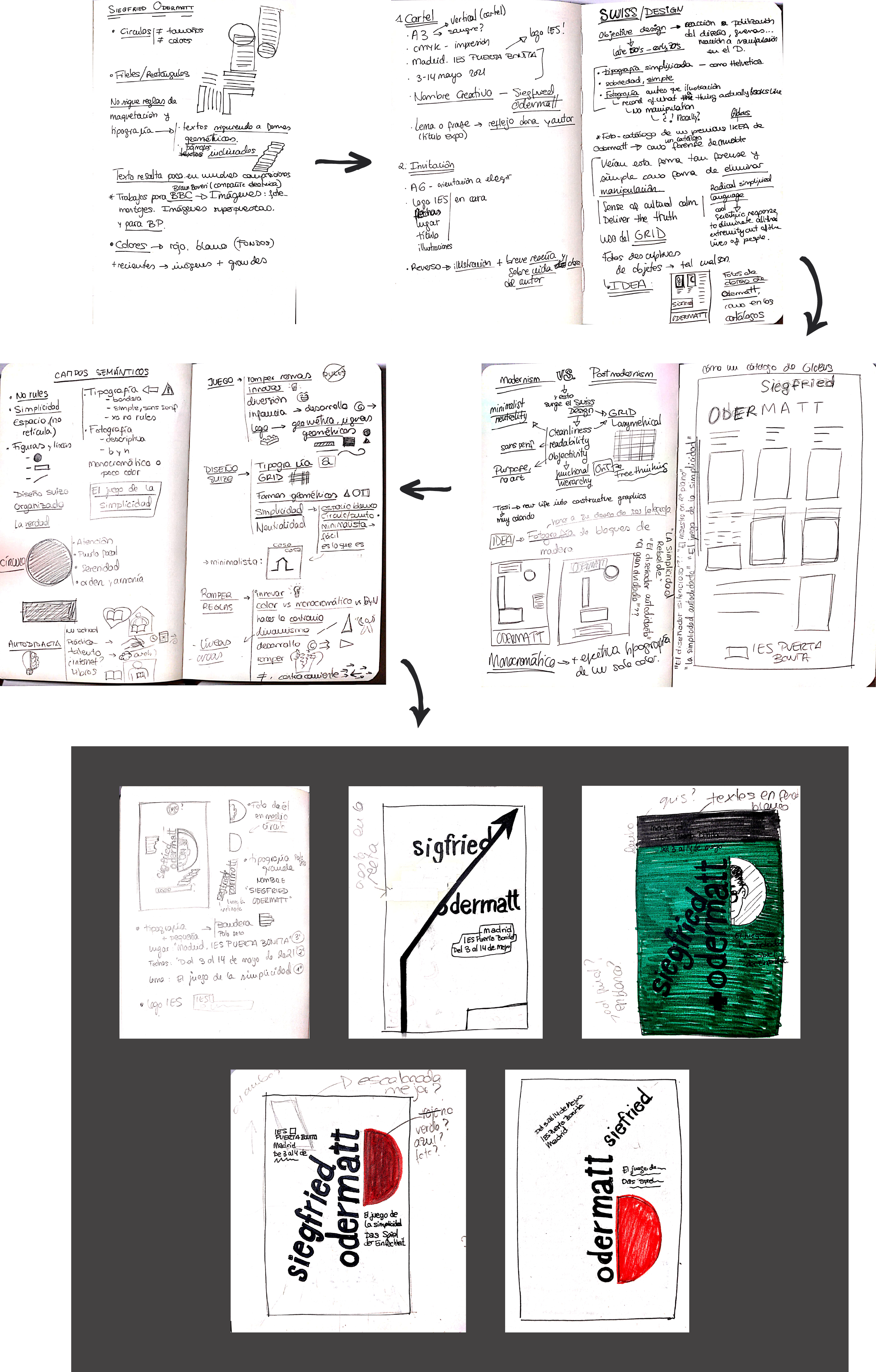
Proposal
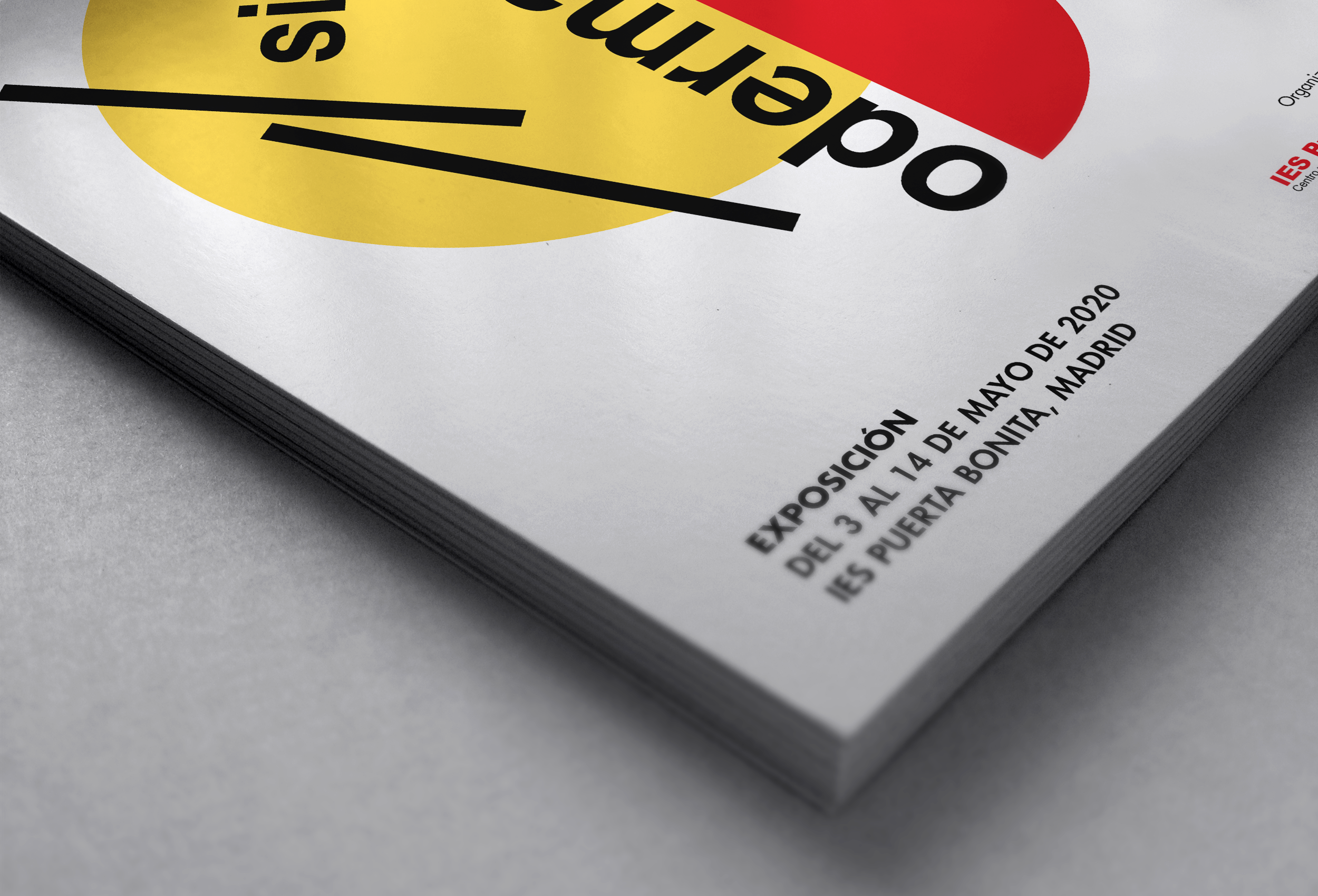
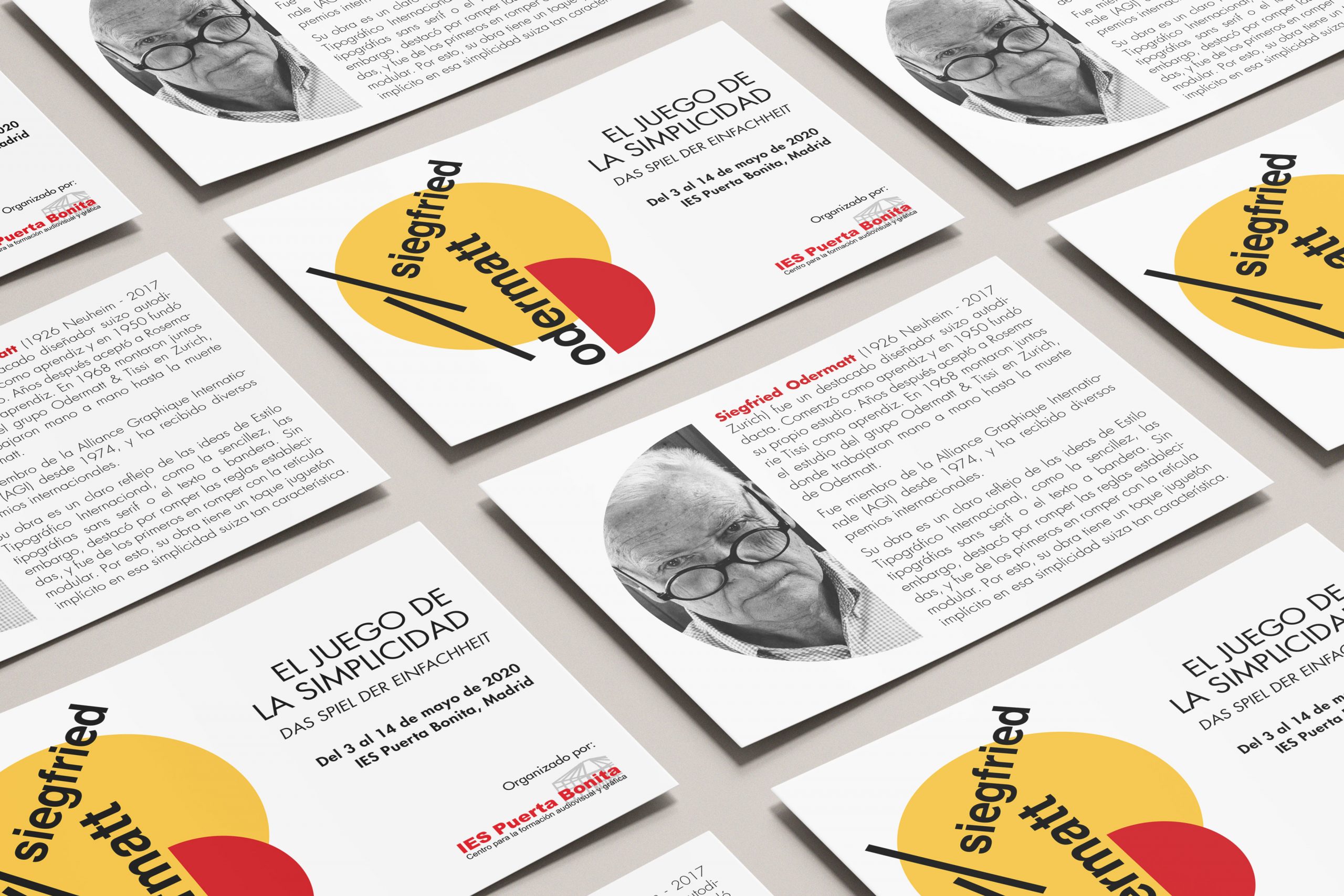
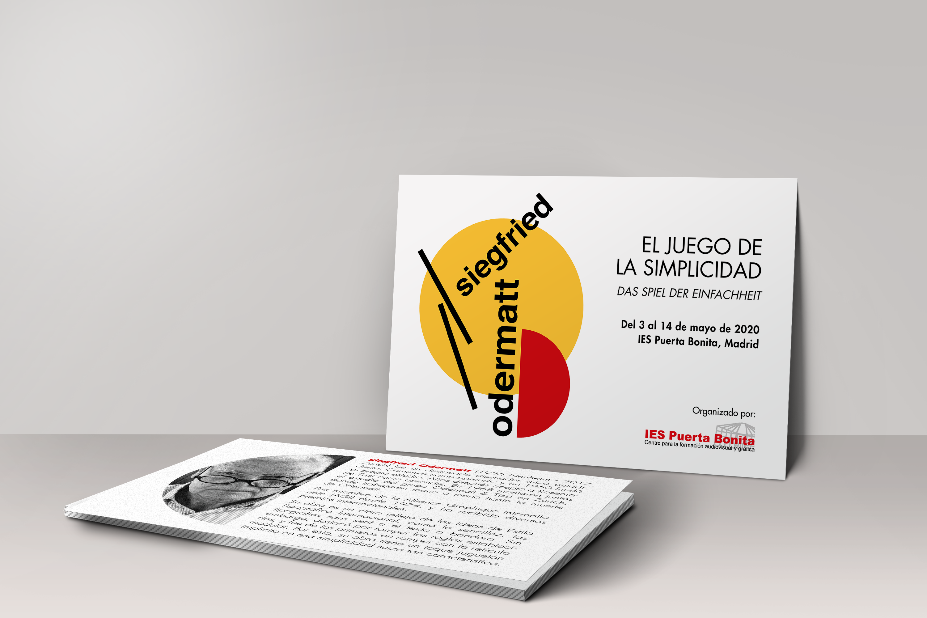
The slogan El juego de la simplicidad is a reflection of Odermatt’s playful, disruptive, but simple style.
As Odermatt broke grids, the poster’s elements are freely placed, while guiding the observer’s eyes through the composition.
Based on the Bauhaus principles, the colour palette is made up of primary colours. The black elements add contrast , standing out above the geometric figures.
View other projects
Packaging
product design